Archetype
Print Collateral
Archetype
Archetype is a natural wellness and performance-focused health center offering chiropractic care, athletic performance training, functional nutrition, and pregnancy support. Following a full rebrand—including a name change from Friends & Family Health Centers—the practice needed printed materials that aligned with their new brand identity and reflected a more polished, professional presence.
I was brought in to design a suite of print collateral that supported day-to-day patient communication while reinforcing the updated brand.
My Role
My work with Archetype focused on translating the new brand identity into practical, patient-facing materials.
The goal was to ensure consistency across printed touchpoints while creating pieces that felt clear, professional, and easy for both staff and patients to use.
What I Worked On
Business cards
Designing updated business cards aligned with the new brand identity.
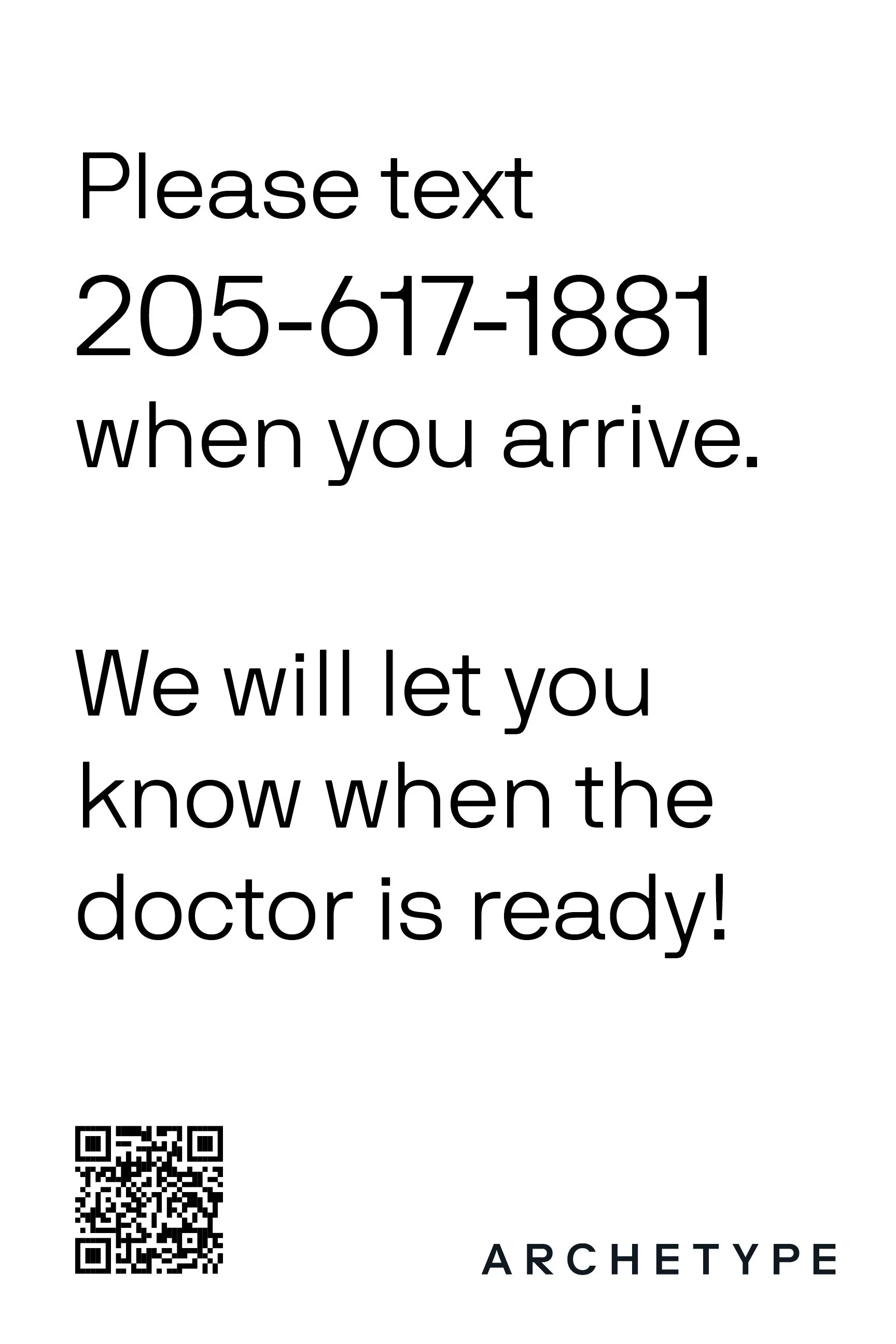
Patient documents
Designing branded patient-facing documents to support in-clinic communication and care processes.
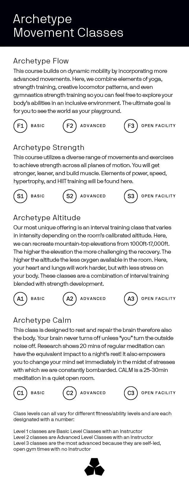
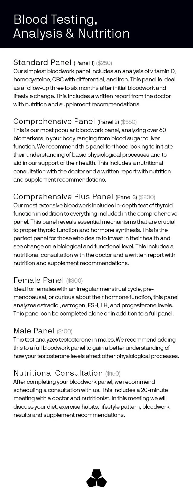
Services information cards
Creating clear, easy-to-reference cards outlining services and offerings.
Notecards
Designing branded notecards for personal communication and follow-up.
The Outcome
Archetype gained a cohesive set of printed materials that reflected their rebrand and supported a more consistent, professional patient experience across the clinic.
Project Details
Industry: Wellness / Chiropractic / Performance Health
Services: Print collateral design
Project Type: Post-rebrand print support
Timeline: Short-term project
Credits:
Logo & Branding:
Ryan Harrison